Charts
The charts shown on this page are currently implemented in meistercharts.
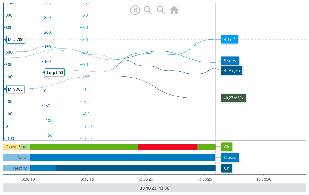
Time Line Chart
The timeline chart is the reason why we build meistercharts. This chart stores its own history thus we can can calculate which part of the data to render on the canvas. This makes this chart very performant even with thousands of data points.
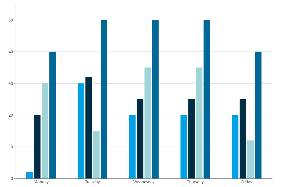
Grouped Bar Chart
The grouped bar chart visually displays data by grouping vertical bars into clusters, each representing a distinct category. Within each cluster, these bars are further subdivided or colored to represent sub-categories or different factors, enabling a quick comparison of data variations across categories. This type of chart is commonly used to highlight differences and trends within complex datasets.
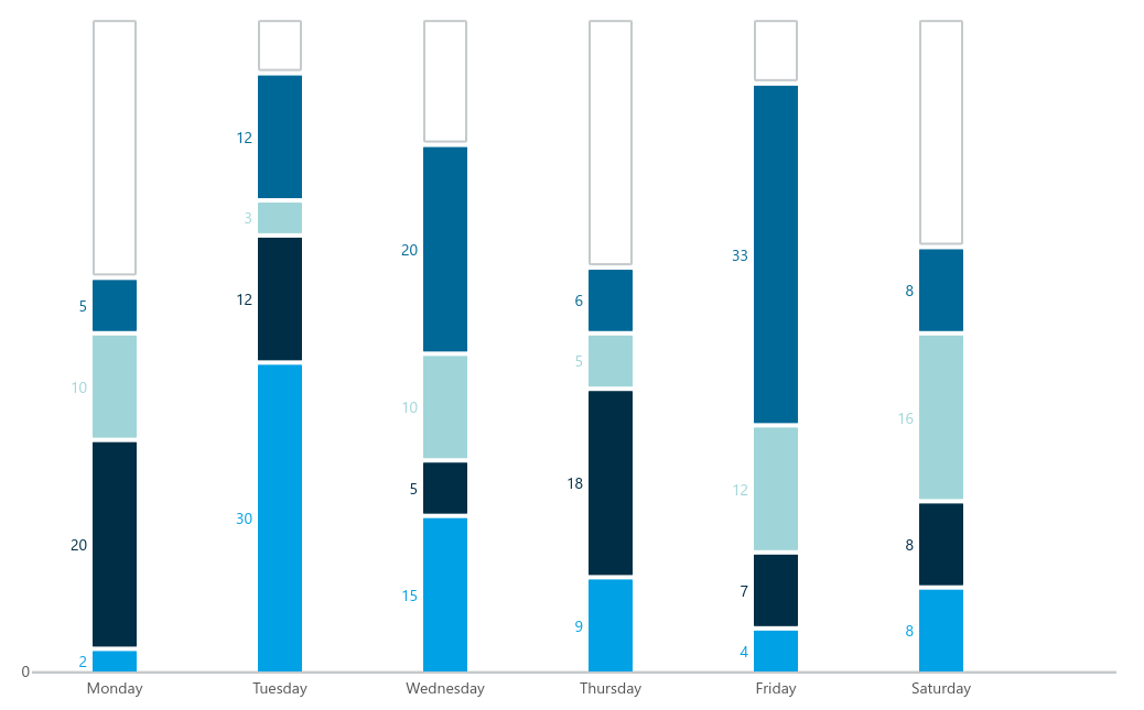
Stacked Bar Chart
A stacked bar chart is a graphical representation that depicts data by stacking horizontal or vertical bars on top of each other. Each bar represents a specific category, and within each bar, different segments or colors represent sub-categories or factors. This chart type is ideal for illustrating how a whole quantity is divided into various components, showcasing the relative proportions of each component within the categories.
Bullet Chart
Our bullet chart is a concise and efficient chart type designed to display a single data point, typically representing a performance metric, against a target or a range of values. It consists of a horizontal bar with a solid line indicating the actual value, a target marker to represent the goal or benchmark
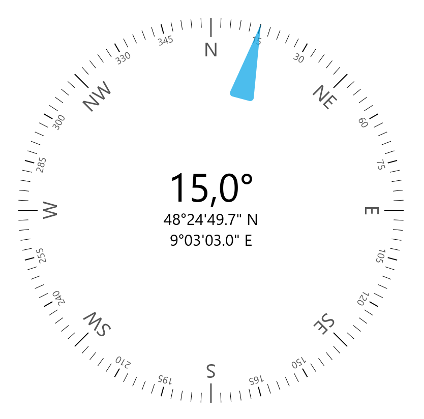
Compass
With the compass chart you can display a location and a direction. The location is represented by longitude and latitute and the direction is a degree value on a cicular scale.
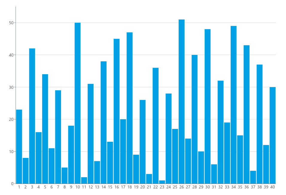
Histogram
A histogram is a graphical representation of data that displays the distribution of a dataset by dividing it into a series of contiguous and non-overlapping intervals or bins along one axis (usually the horizontal axis). The vertical axis represents the frequency or count of data points falling into each interval. Histograms are used to visualize the shape and spread of data, allowing for an understanding of data patterns, central tendencies, and variations.
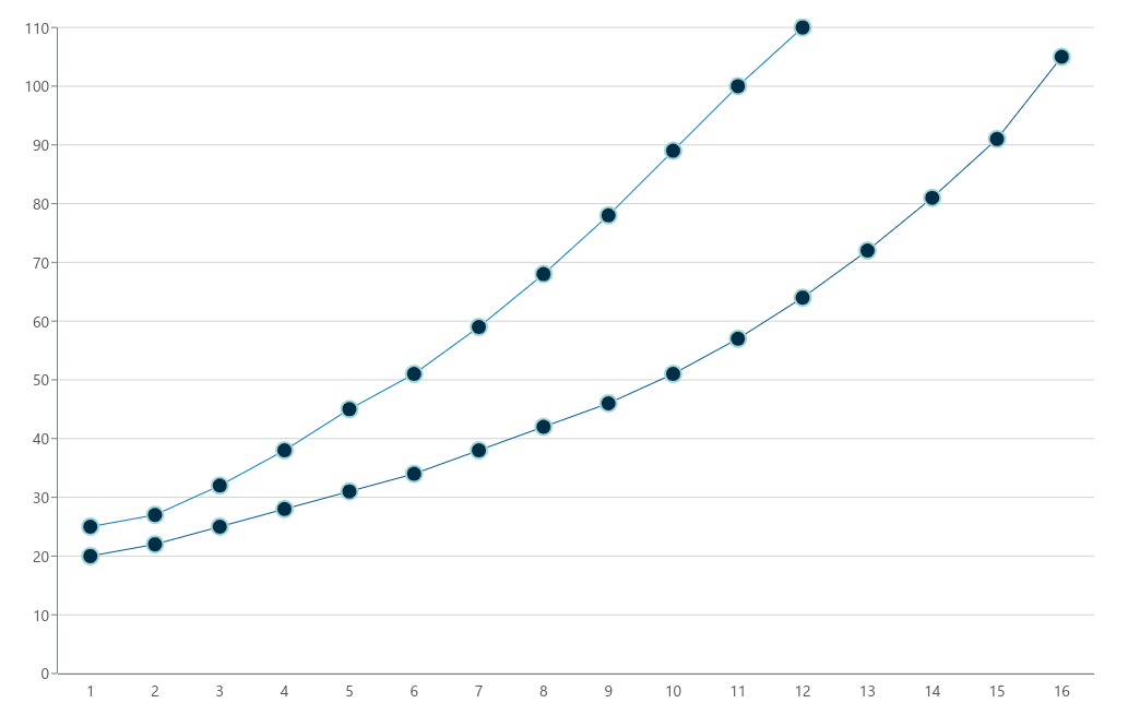
Simple Line Chart
A line chart is a type of graph that displays data points connected by straight lines, typically used to represent trends or changes in a dataset over time or across a continuous range. The horizontal axis represents the independent variable (e.g., time, distance, or other ordered values), while the vertical axis represents the dependent variable (e.g., values, measurements, or counts).